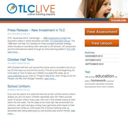
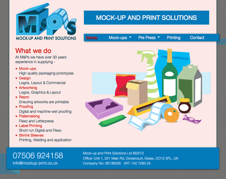
Been working on some flexible style sheets for someone else so I thought I should do some for me so I’ve started on the homepage of this site (its the one most people look at). As ever its a work in progress I have not done this blog yet.
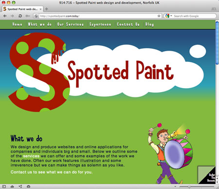
This is the homepage at 900px wide:

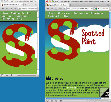
This is the homepage at 300px and 500px wide:

Why
People are using a wide range of devices of different screen sizes and resolutions. You want your content to look good on all those devices don’t you?. Even if its only for legibility. Designing a site to only work on a huge great desktop monitor will please the art director when he prints it out but it isn’t going to please a customer who is using a 1060px wide screen or even a customer with his browser window set as a small portion of a larger screen.
How
I’ve been using media queries support does vary somewhat across desktop devices. The most notable one I found didn’t work for me was Internet Explorer 8. You can get around that one if you include a js script. You can get an idea of the support offered by various browsers on When can I use.
What sizes? devices
It depends on your circumstances, what kind of devices are people using to visit your site with. If you have a load of visitors using massive art director style monitors you might want create a very big screen set of styles. If lots of people are using small screen devices then you need to look at those. If only a very small number of people use that very odd dimension then it might not be worth bothering.
Desktop browsers
This is reasonably easy you can resize your browser window and see how you site adapts in your various browsers. Opera is good for this as they have a simple tick box that allows you to turn on ‘show webpage dimensions in titlebar’ which gives you a simple way to see the current depth and height as you resize. On a Mac its under Opera > Preferences > Advanced > Browsing.
Mobile devices
You can check your site in emulators as starting point but support does vary from device to device and ideally you want to test on real devices. They have settings that alter how they display your content that might be set to zoom out a larger site or ignore the media queries you have made completely.

When
Ideally you should do this stuff when your putting a site together to start with and consider it when designing the site. Some things are awkward to scale, I’ve found tables awkward in the past.
You can bash an existing site into a more flexible approach or just the most used parts of the site.
